Proposed Identity and Collateral
Rain City Burgers
Rain City Burgers is my favorite Seattle burger joint and my go-to post hike meal, so when I was challenged to redesign a local restaurant’s logo and menu I knew I wanted to give them the special treatment.
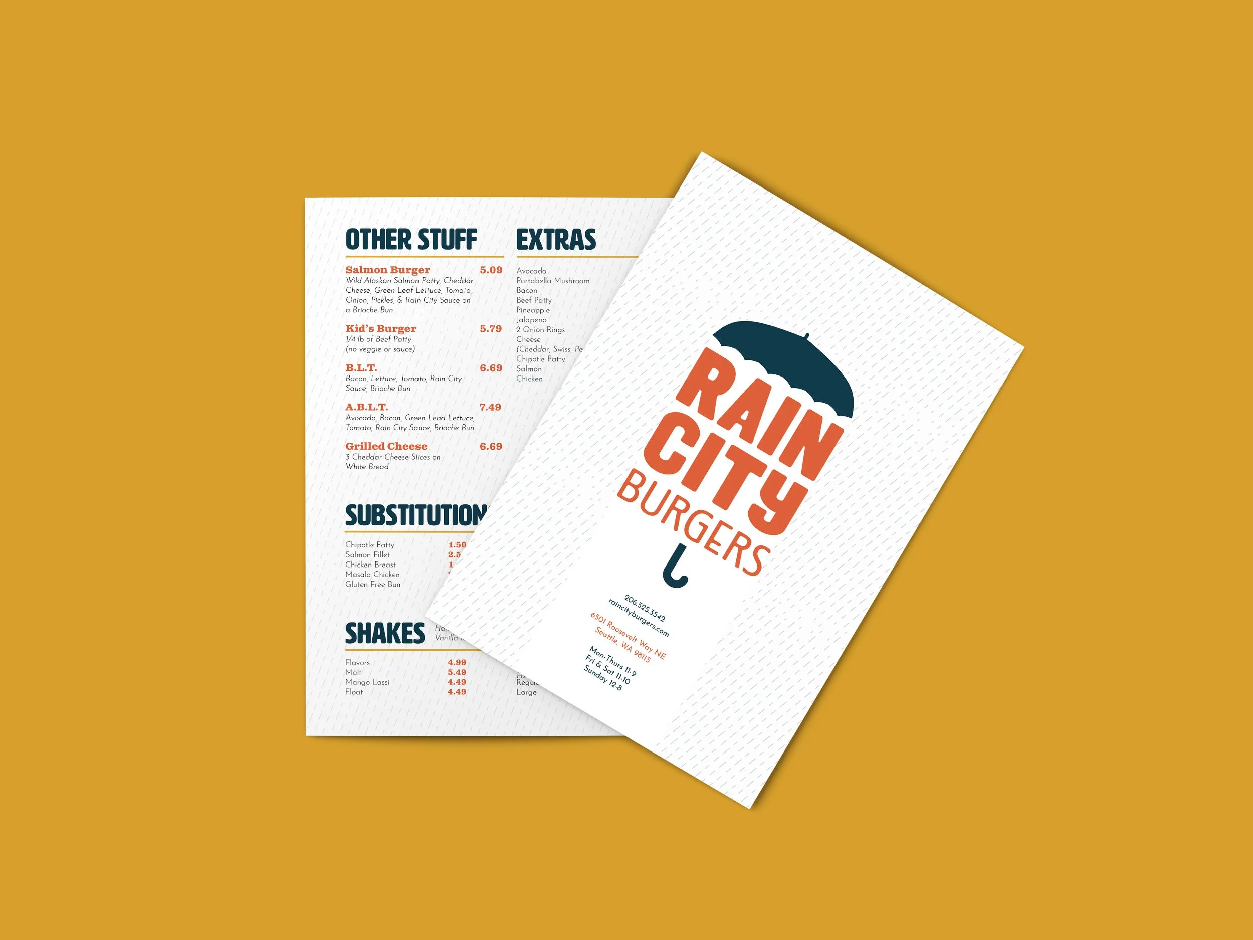
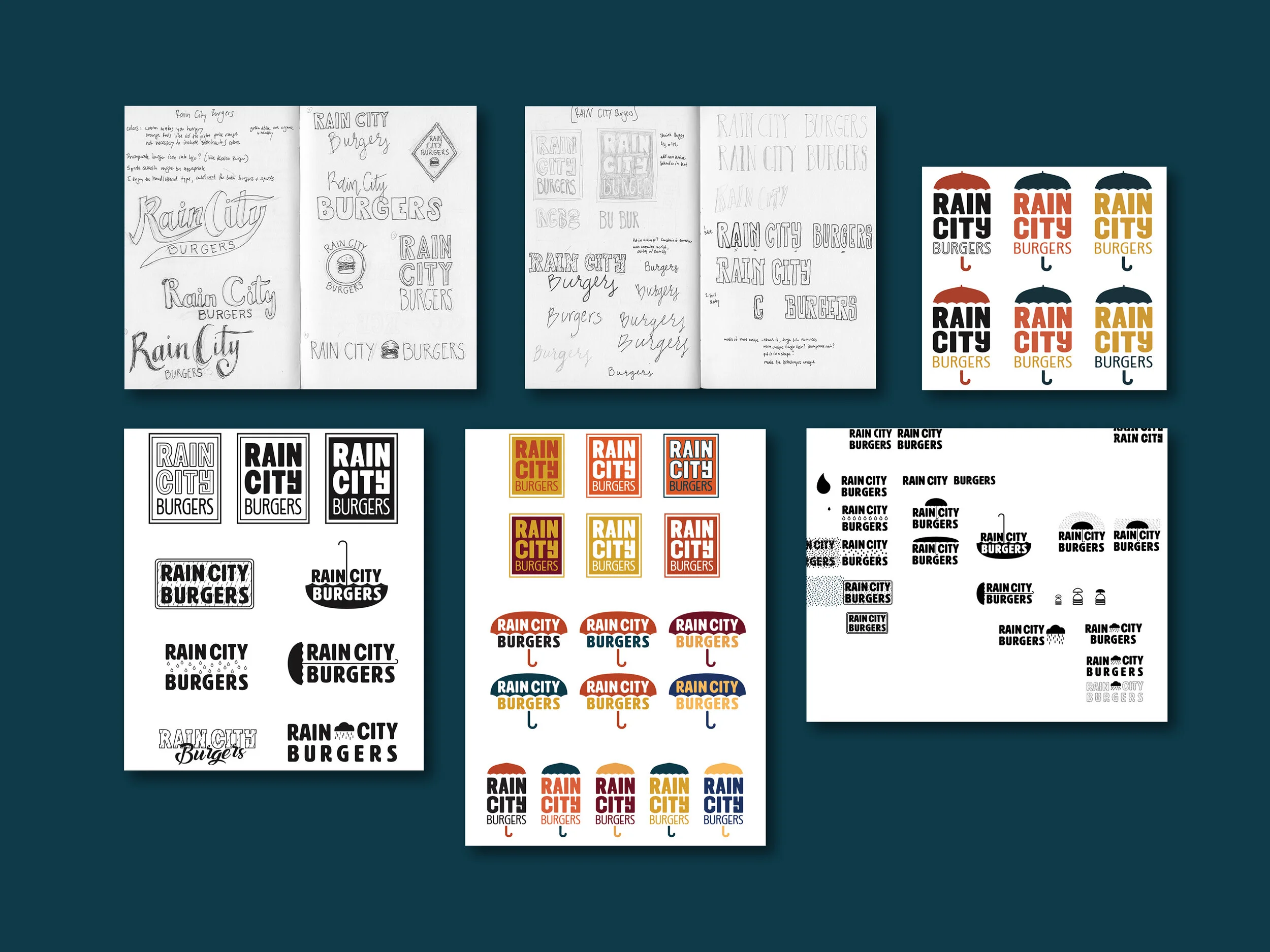
Experimenting with multiple logo iterations led to a final version that combines brightly colored text with umbrella imagery - an icon that references both the business name and classic Seattle weather. Combining the new logo with a rain texture on many of the printed products created a playful identity system that suits both the burgers and the town.
The final suite of deliverables displays a clean and eye-catching design that best conveys the offerings of the restaurant - quick and affordable yet tasty burgers in an upbeat, casual atmosphere.
Project
Rebrand: new logo and collateral design
Role
Graphic Designer
User Group
Rain City Burgers creative team, restaurant patrons
Sketches and Logo Iteration
Final Mockups
Menu Exterior
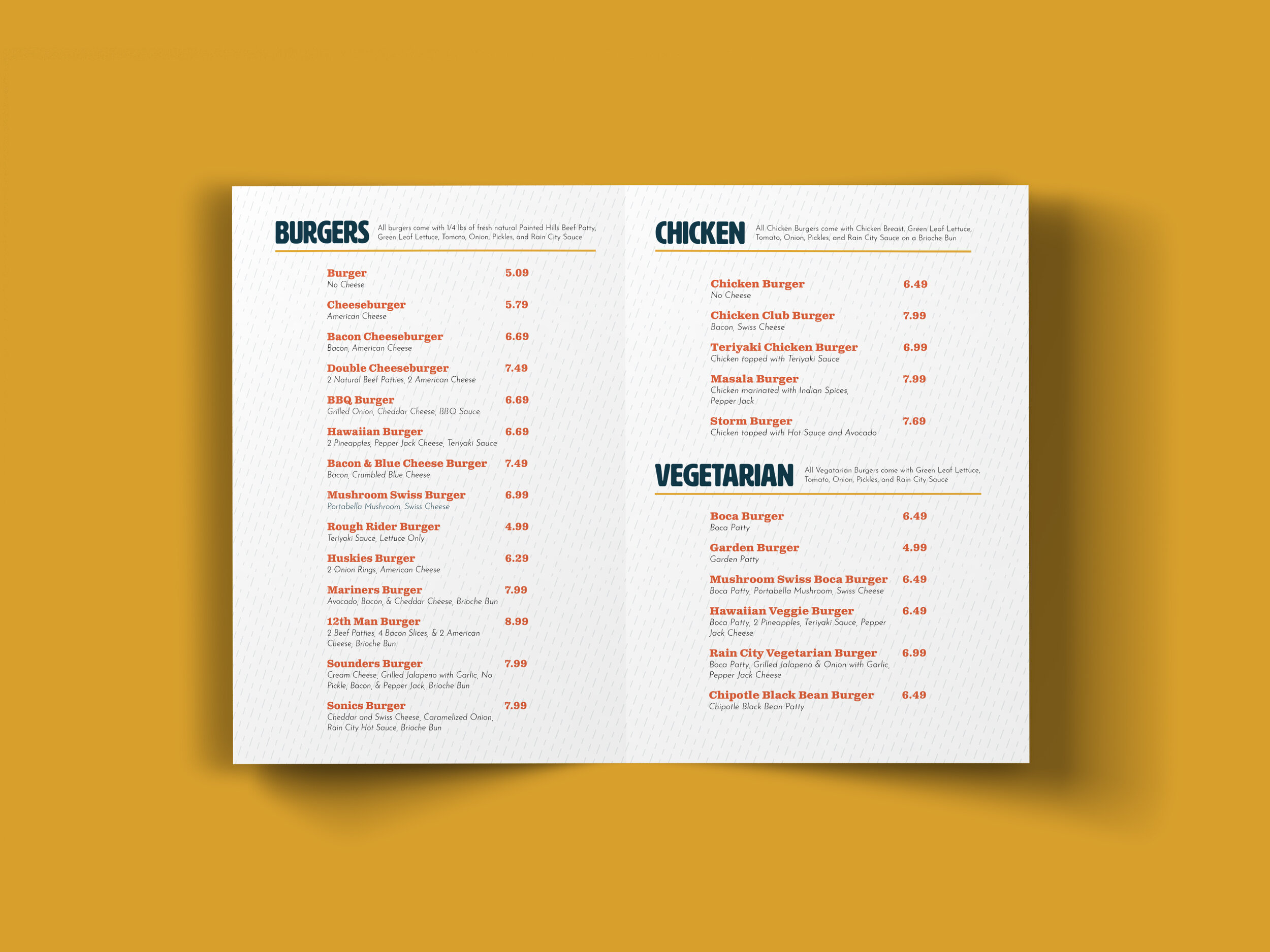
Menu Interior
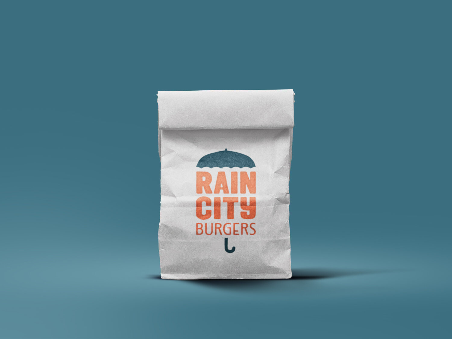
Takeout Bag
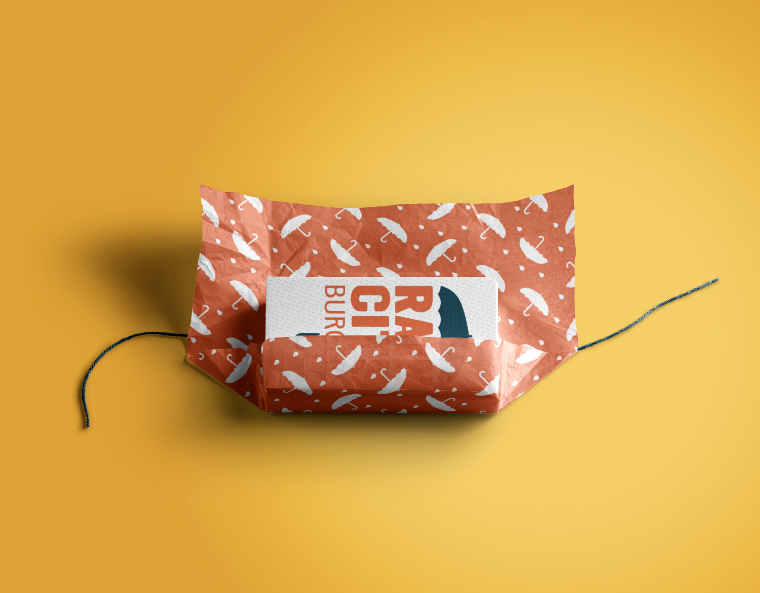
Wrapping Paper
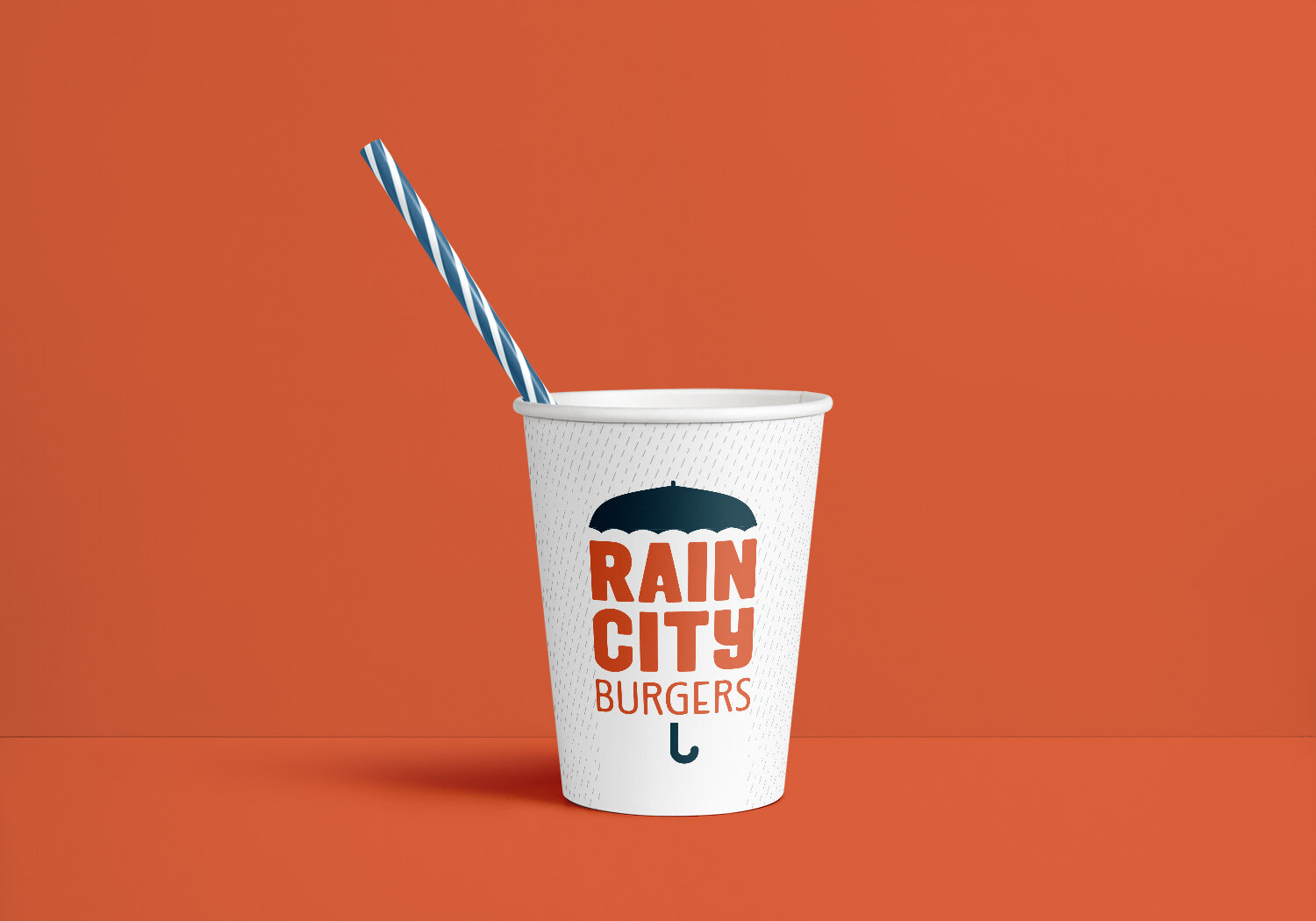
To Go Cup
Business Cards and Letterhead
